
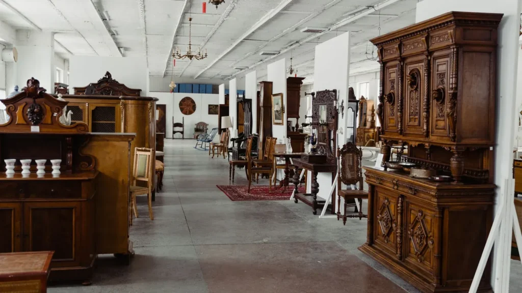
Furniture and home decor store lighting is not a brightness problem, it is a material problem. A walnut sideboard, a cream boucle sofa and a brushed brass lamp all sit under the same ceiling, and the same 3000 K beam makes two of them look right and one of them look dead. What separates the three is the angle the light arrives at, how much of it reflects off the surface towards the shopper’s eye, and whether the colour temperature lets the finish read as the material it is. This guide gives you the numbers for all three, in the order you actually make the decisions.
The short version, if you are specifying this afternoon: keep the merchandise at 2700–3000 K with CRI 90+ and R9 above 50, put the accent pool at about three times the surround level, aim the beam so the shopper never looks into the mirror direction of a lacquered or metal surface, and give the shelf wall its own head count rather than treating it as leftover floor lighting. The rest of this page is the arithmetic behind those four sentences.

Why furniture lighting is a texture brief, not a lux brief
In a clothing store the product is flat fabric hanging at eye level. In a furniture hall the product is a volume with a top, a face, a grain, a pile and often a metal leg, at heights from 0.35 m to 2.10 m, viewed from 0.6 m away and from 6 m away in the same visit. The shopper is not deciding whether it is bright enough to see. They are deciding whether that oak will look like the oak in their living room.
Three properties of the surface do all the work:
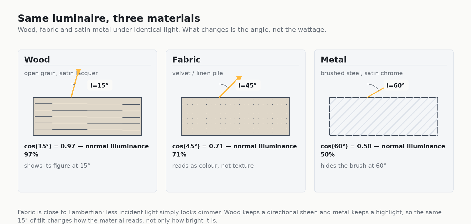
- How it scatters. Fabric and unfinished wood are close to Lambertian: light leaves in every direction, so the surface shows colour and shape. Satin lacquer and brushed metal are partly specular: light leaves in a narrow cone around the mirror direction, and the surface shows a highlight instead of itself.
- How it is oriented. A sofa top faces the ceiling and receives light almost straight on. A bookcase face is vertical and receives it at 70–85°. The same luminaire delivers very different numbers to the two.
- How its colour responds to CCT. Warm wood and warm textiles gain from 2700–3000 K. Move that same walnut under 4000 K and the red-orange component of the finish loses its anchor: the piece turns grey-brown and reads as a cheaper material.
This is the same logic that drives retail display lighting specifications across other categories, but the material mix in a furniture hall shifts the emphasis from beam angle arithmetic to incidence angle arithmetic.

The angle of incidence decides whether the material shows up at all
One equation governs most of this article. For a surface tilted so that the incoming light arrives at an angle i from the surface normal:
Esurface = Enormal × cos i
That is the illuminance landing on the surface. At 15° off normal you keep 97 % of it. At 45° you keep 71 %. At 60° you keep 50 %. When a beam is aimed at a shelf face rather than at a table top, i climbs towards 80° and you keep barely 17 % — which is why a row of heads that measures beautifully on the floor plan can leave a bookcase face completely flat.
The reflected side runs the other way. Specular reflection scales roughly as 1/cos i, so a surface seen near the mirror direction gains brightness even as the light on it falls:
| Incident angle i | Light landing on the surface | Specular component (relative) | What the shopper sees |
|---|---|---|---|
| 15° (near normal) | 97 % | ×1.00 | Table tops, seat cushions: colour and grain read clearly |
| 45° | 71 % | ×1.37 | Textiles still read; lacquer starts to show a sheen band |
| 60° | 50 % | ×1.93 | Brushed metal flattens; satin lacquer becomes a mirror |
| 80° (shelf face) | 17 % | ×5.6 | Only edges and gaps read; the face goes dull or hot |
A practical way to think about it: tilt changes three things at once. At 60° the surface receives half the light it would at normal incidence, reflects 1.93× more of it straight back towards the shopper, and is being viewed at a shallower angle, so each square centimetre of it stands for a larger area of the finish. On a satin-lacquer sideboard those three effects together are the difference between “veneer with a grain” and “brown rectangle”.
If you want the layout side of the same geometry — mounting heights, pool diameters and spacing — it is worked through in retail display lighting that sells the product. What follows here is what to do when the product is a 2.4 m wide sideboard rather than a handbag.
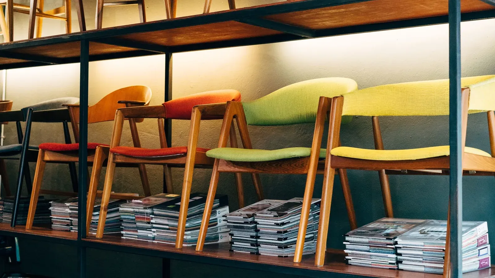
Where the highlight lands: grazing angles on a shelf wall
Shelf walls and display furniture are where the arithmetic stops being theoretical. Take the arrangement almost every furniture store ends up with: a rail at 3.00 m, a shelf wall with faces at 0.60 m and 1.20 m above the floor, and a head sitting some horizontal distance from the wall. The grazing angle at the shelf face is:
i = atan(h / d), where h is the height from head to shelf and d the horizontal offset.
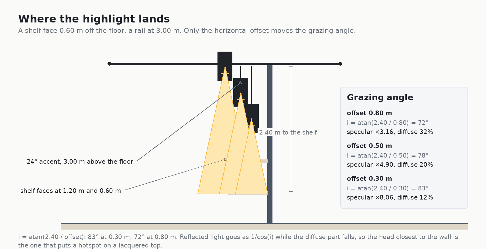
With h = 2.40 m, an offset of 0.30 m gives i = 83°, an offset of 0.50 m gives 78°, and an offset of 0.80 m gives 72°. Three consequences follow immediately, and they are why the same rail position can look luxurious on one wall and cheap on another:
- Illuminate falls away. At 0.30 m the shelf face receives 12 % of normal illuminance; at 0.80 m, 20 %. Further out is brighter, which is counter-intuitive until you remember that grazing light is spread over the face rather than landing on it.
- Specular gains. The reflected component goes as 1/cos i: ×8.06 at 83°, ×4.90 at 78°, ×3.16 at 72°. The head closest to the wall gives you the brightest highlight and the least actual light. On satin lacquer that is a hot band; on metal it is a glare patch.
- The shopper’s eye position completes the problem. Highlights are not a property of the luminaire, they are a property of where the luminaire is relative to the viewer. A 25° tilt change can move the hotspot into a shopper’s eye line at the exact height where they lean in to open a drawer.
The fix is not “aim it flatter”. It is to move the rail or to choose the optic:
- Pull the rail out so the head sits 0.8–1.2 m from the wall and aim back at the merchandise. The angles drop into the 60–70° range where the face still reads.
- Use an asymmetric wash head for the shelf wall itself and keep the accent heads for the furniture sitting away from the wall. Wall washing with an offset forward reflector keeps a more even face than any tilted spot.
- Keep satin and semi-gloss finishes off the mirror axis: if the finish is a 4 out of 10 gloss, plan the beam so that the shopper’s standing position is at least 30° away from the mirror direction. Flat matt finishes, matt lacquer and open-grain oiled wood are forgiving and can take a much hotter spot.
Working an example: a 6.00 m shelf wall at 3.20 m
The shop floor number that usually surprises the client is the head count. A 36° optic at 3.20 m gives D = 2 × 3.20 × tan 18° = 2.08 m of pool. At 30 % overlap the spacing is 2.08 × 0.70 = 1.46 m, so a 6.00 m wall needs 6 heads. Drop the overlap to 0 % and it takes 4; push it to 50 % and it takes 7.
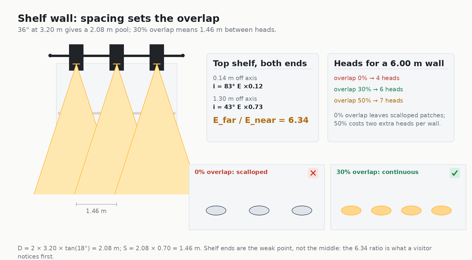
Four heads is the number most schedules start with, and it is the one that produces scalloped patches along a bookcase. The shelf ends are the weakest point, not the middle: with the top shelf at 2.00 m and 0.14 m off axis, the near end receives ×0.12 of normal illuminance, while a point 1.30 m further along receives ×0.73. That is a 6.3:1 difference across one piece of furniture, and visitors notice it long before they notice a lumen figure.
Colour: the four numbers that make a finish read right
Warm wood is the product in most furniture halls, and warm wood is the hardest thing to light convincingly. Four numbers decide it.
Colour temperature: 2700 K or 3000 K, never uniform 4000 K
3000 K at CRI 90+ is the safe default for timber, leather and textiles. 2700 K is better for antique and reclaimed pieces, walnut, and velvet, where the extra warmth flatters the red component. 3500 K and 4000 K both work for the merchandise and both cost you something: they make cream linen look grey and oak look like beech.
One nuance worth keeping: mixing 2700 K and 3000 K between the ambient layer and the accent layer is a technique, not an error, as long as the difference is deliberate and consistent along the ceiling. What destroys a hall is a row of heads where the CCT varies head by head because they were bought in different budget cycles. The same discipline appears in our note on 2700 K versus 3000 K, where the judgement is made on the food rather than the furniture.
CRI, R9 and TM-30: ask for all three
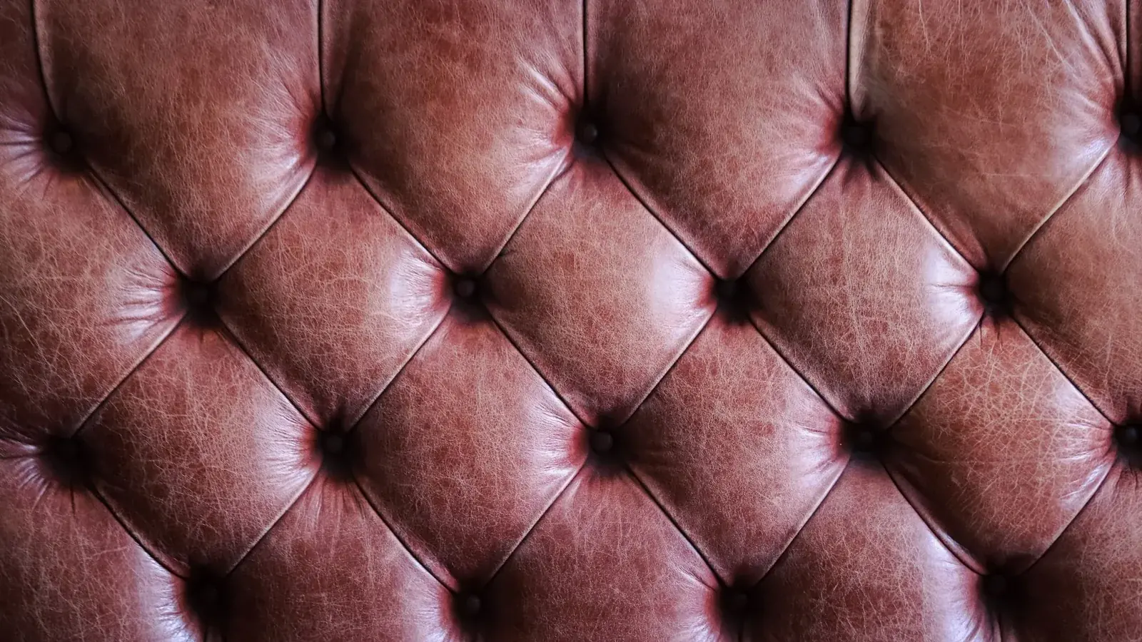
CRI 90+ is the entry ticket. R9 (deep red) is the number that decides whether walnut, mahogany and oxblood leather look alive; below 50 the reds go muddy even at Ra 95. TM-30 Rf and Rg give you the gamut picture that CRI cannot. For a furniture hall the practical spec is Ra ≥ 90, R9 ≥ 50, Rf ≥ 88, and if you are also lighting art on the walls of a showroom, the tighter targets in art gallery lighting standards apply to those walls.
SDCM: why 20 heads is not one light
Colour consistency is measured in SDCM (macAdam) ellipses. SDCM 3 or better keeps a long run of heads reading as one installation; SDCM 5 is visible as a tint shift between neighbouring pools on a white ceiling and, worse, on cream upholstery. For furniture and home decor, where a customer may buy a sofa today and a matching armchair in three months, a written SDCM figure is part of the product promise, not a technical nicety.
Viewing geometry: the angle is a colour question too
Finish sheen changes perceived saturation. A high-gloss lacquer gets desaturated by its own reflection: raise the specular component and the colour you see drops. A matt finish shows almost pure diffuse colour. When you specify a gloss level for the product, specify the lighting together with it, because a customer who sees a lacquered piece in a softly lit hall and takes it home to a 4000 K room will describe the colour as “not the same”.
Home decor store lighting: the small-object layer
Home decor is the other half of the brief and it has a different failure mode. Vases, ceramics, textiles, candles and picture frames are small, are shown in clusters, and are usually lit with far too little contrast. A decor floor lit evenly at 300 lux reads as a stock room; the same floor with 100 lux ambient and 300 lux on the objects reads as a collection.
- Ratio, not level. Aim for 3:1 accent-to-ambient on feature objects, 4:1 for a single hero piece. This is the same ratio logic as showroom lighting, scaled down to objects 30 cm tall.
- Narrow optics on small pieces. A 15° to 24° beam at 2.2–2.8 m keeps the pool on the object. Going wider washes the neighbouring shelf and removes the very separation you want.
- Decor walls are shelf walls. Everything in the grazing-angle section applies; a ceramic vase on a shelf face is a vertical surface with a specular glazed finish, the worst case for hotspotting.
- Vertical merchandising needs its own aiming. A 2.10 m high display is two different lighting problems: the top third wants a wash, the bottom third wants an accent that does not put the shopper’s shadow across it.
For the decor-heavy end of the floor, magnetic low-voltage systems reduce how much hardware interrupts the ceiling, which matters when the merchandise is the visual noise and the fixture should not be. If you are choosing between track families, magnetic versus traditional track lighting compares the two on adjustment range, driver location and maintenance access.
Three ways a furniture hall reads wrong
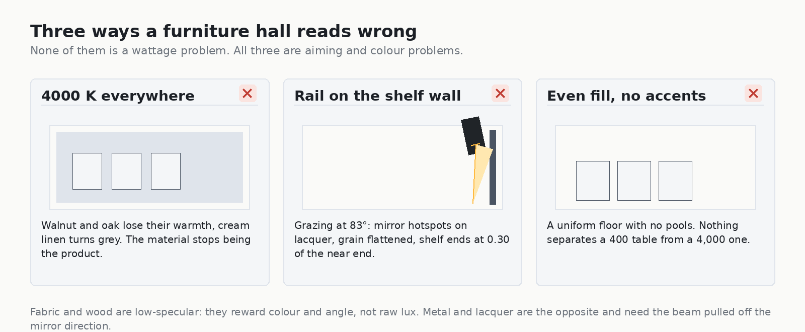
These three account for most of the failed inspections of the visual kind, which no code will catch.
One: 4000 K on a warm floor
Cool white is the cheapest and most available colour temperature, so it ends up everywhere. Walnut loses its warmth, oak reads as ash, cream bouclé turns grey and brass turns pale. The lighting is not broken; it is selling a different version of the product. On a timber and textile floor, 4000 K is a brand decision with an economic consequence.
Two: rail tight to the shelf wall
83° grazing, 12 % of the light on the face, 8× the specular peak. The result is a bright strip at the top of the bookcase, a dark bottom, and hotspots on every lacquered surface. The cheapest fix is to move four heads and re-aim, not to add heads.
Three: even fill with no accent layer
A shadowless floor with a uniform 400–500 lux and no pools of light flattens every price signal. A €400 side table and a €4,000 side table look like the same object. In a furniture store the accent layer is the merchandising, so it should be in the lighting budget before the decorative pendants are chosen.
The fixtures that do this work
Everything above resolves into a short list of mechanical requirements: a rail that can be positioned 0.8–1.2 m off a wall, a narrow optic for accents, an asymmetric wash head for shelf faces, an adjustable tilt that holds its aim, and colour data supplied in writing. The range below is built for exactly this brief.
OVEGA Projector 10–25 W — the accent head for furniture
A framing projector with four adjustable blades, which is the single most useful tool for a furniture hall because display geometry is rarely rectangular in the useful way. The blades cut the beam to the outline of the piece, so a dining table gets a rectangular pool rather than a circular cone spilling onto the carpet, and the pool edge stops exactly where the product stops. With 18° to 36° of zoom and a movable ring switching between a crisp cut edge and a soft one, the same head serves a sofa group and a single armchair. Full spec: OVEGA Projector 10 W to 25 W. Output is published per optic angle and per wattage, so the pool can be sized against a real lumen figure rather than a nominal wattage.
AIMER 25 W / 30 W / 35 W — the general accent for open floor
A three-wattage family covering a spread of about 2:1 in connected power, which matters because AIMER track light 25 W to 35 W heads over a 0.45 m–0.60 m wide table only need the low end, while the same head over a 2.4 m sideboard needs the high end. One part number across a floor keeps the colour and the optics consistent, and the SKU difference absorbs the wattage.
CADIO 20 W / 25 W / 30 W — the shelf wall head
Designed for wall-adjacent work: the body and the optic work at tilt without the beam clipping the rail, so a CADIO track light 20 W to 30 W can hold the 60–70° geometry a shelf face needs. Use them where the rail cannot move out to 1.2 m.
SLEM linear light — the even layer
Continuous linear is the cheapest way to get a clean wall wash along a tall bookcase, and the per-metre figure is easier to defend in a wattage budget than a string of discrete heads. The arithmetic for that comparison, in W per metre against W per head, is in our guide to linear track lighting for retail.
When the layout is already fixed
If the ceiling is set, the rails are in and the furniture is being built to plan, the fastest route to a correct answer is to send us the layout and the finish schedule. We will come back with head positions, optics and CCT per zone against the actual furniture heights — the track lighting RFQ guide lists what to include so the first answer is the usable one, and the track light product range has the base spec for every family above.
Frequently asked questions
What colour temperature should a furniture store use?
3000 K with CRI 90+ is the safe default for timber, leather and textiles. Use 2700 K for antique, reclaimed and walnut-heavy ranges, where the extra warmth flatters the red component of the finish. Avoid a uniform 4000 K on a warm floor: it makes oak read as ash and cream linen read grey. Whatever you choose, hold it across the installation and specify SDCM 3 or better.
Why does my satin-lacquered furniture show a white glare band?
Because the beam is arriving near the mirror direction of the surface and reflecting into the shopper’s eye. The reflected component rises as 1/cos of the incident angle, so the head closest to the wall is usually the culprit. Move the rail out to 0.8–1.2 m from the wall and aim back at the piece, or shift the shopper’s viewing angle at least 30° away from the mirror direction.
How many heads do I need over a shelf wall?
Divide by spacing, not by eye. A 36° optic at 3.20 m gives a 2.08 m pool; at 30 % overlap that is 1.46 m between heads, so a 6.00 m wall takes 6. At 0 % overlap it takes 4, and 4 is what produces the scalloped patches that make a bookcase look unfinished.
Is CRI 90+ enough for wood and leather?
Not on its own. CRI averages eight pastel samples and says little about deep reds, which is exactly the range that decides whether walnut and oxblood leather look alive. Ask for R9 ≥ 50 on top of Ra ≥ 90, and TM-30 Rf ≥ 88 if the supplier publishes it.
Should I light furniture from the ceiling or with floor and table lamps?
Ceiling track does the merchandising and the wall wash; lamps do the “home” story. If the lamps are part of the display, they need to be on a separate circuit at a fixed colour temperature, or they will fight the ceiling layer and create colour cast on the upholstery right next to them. Turn them on for photography and for evening viewing, not as the ambient layer.
What about the shop window at night?
The window is judged from the street, against a bright road. It usually needs the highest contrast in the store — a 4:1 to 6:1 accent-to-surround ratio — and a CCT that matches the interior or the same sofa changes colour between the pavement and the showroom floor.
Specify in the order that survives the value engineering
Furniture and home decor store lighting fails in a predictable order when budgets get cut. Someone removes the accent layer first, then normalises the colour temperature to the cheaper 4000 K option, then moves the rails against the walls to tidy the ceiling plan. Each step is individually defensible and together they produce a hall where every finish looks 30 % cheaper than the piece actually is.
So write the specification in the order of consequence: materials first — which finishes are satin, which are gloss, which are metal; geometry second — rail offset from the wall and the resulting grazing angles; layers third — ambient, accent and shelf wash, with a ratio for each; colour last but written down — CCT, Ra, R9, Rf, SDCM. Then put the head count on the drawing, because that is the number a value-engineering exercise will actually change.
If you would rather start from the numbers than from the fixtures, send the floor plan and the finish schedule to our team: we will come back with head positions, optics and CCT per zone, priced against the track light range. For projects that also need certification documentation, both American and European marks are covered in cETLus certification, and the wider set of lighting engineering notes lives under lighting insights.